To wrap up our examination of WPF styles, let’s take a quick tour of how Blend can help automate the process of style construction. Again, however, I’ll hold off discussing the animation editor (and related topics, such as triggers and control templates) until the next chapter. Here I want to point out the default “Simple Styles” of the Assets Library.
Blend ships with a number of default styles for common controls, referred to as the Simple Styles. If you open the Assets Library, you can locate the Styles in the tree view on the left-hand side (Figure 30-20).
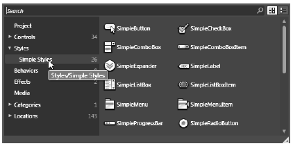
Figure 30-20 Blend’s default styles
When you select one of these simple styles, a few things happen. First, the control is declared with the {DynamicResource} markup extension. For example, if you place a Simple Button Style on your designer, you’ll find XAML similar to:
<Button Margin="116,49,220,0" Style="{DynamicResource SimpleButton}"
    VerticalAlignment="Top" Height="63" Content="Button"/>
Strangely enough, the control will look identical to a normal Button. However, if you take a look in your Project window, you will see Blend has added a new file named Simple Styles.xaml (Figure 30-21).
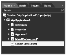
Figure 30-21 This is a resource dictionary!
If you double-click on this item and open the XAML editor, you will see it is a very large <ResourceDictionary> of default control styles. Furthermore, if you open the Blend Resources window, you’ll see each item is listed and can be edited by clicking a given entry (Figure 30-22).
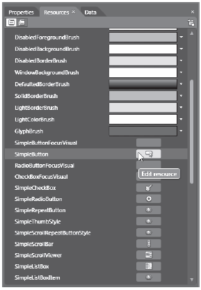
Figure 30-22 Selecting a default style for editing
If you click on the SimpleButton icon in the Resources view, a new designer will open that you can use to change the style to your heart’s content using Blend’s standard editing tools (the Properties window, animation editor, etc). Consider Figure 30-23
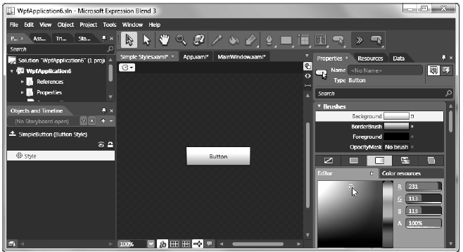
Figure 30-23 Editing a default style
The beauty of this approach is that the Simple Styles.xaml file is merged with your application resources and, therefore, all of your local edits will automatically be compiled into your application. Taking advantage of default simple styles essentially allows you to use starter markup for a control’s normal look and feel, and customize it on a per-project basis. Here’s the markup that would be in your App.xaml file:
<Application
    xmlns="http://schemas.microsoft.com/winfx/2006/xaml/presentation"
    xmlns:x="http://schemas.microsoft.com/winfx/2006/xaml"
    x:Class="WpfApplication6.App"
    StartupUri="MainWindow.xaml">
    <Application.Resources>
        <!-- Resources scoped at the Application level should be defined here. -->
        <ResourceDictionary>
            <ResourceDictionary.MergedDictionaries>
                <ResourceDictionary Source="Simple Styles.xaml"/>
            </ResourceDictionary.MergedDictionaries>
        </ResourceDictionary>
    </Application.Resources>
</Application>
Well, that wraps up this chapter. The next chapter will complete our examination of WPF by looking at the role of control templates and custom classes. Along the way, I’ll also illustrate several new aspects of working with Expression Blend.